


Families don’t browse senior living websites for fun. They come with urgency. Stress. A decision that feels overwhelming.
And the truth is, they make decisions quickly.
Your website is often the first serious interaction they’ll have with your community. If it’s slow, outdated, or confusing, they won’t wait around. They’ll click away and book a tour somewhere else.
That’s why senior living web design isn’t about “looking nice.” It’s about clarity, speed, and trust.
Google confirms that sites loading in under 2.5 seconds see stronger engagement. Deloitte found that even a 0.1-second improvement can increase conversions. Families can feel that difference, and they act on it.
In this guide, you’ll see what great senior living websites look like, which design choices actually drive tours, and how to build a site that both Google and families trust.
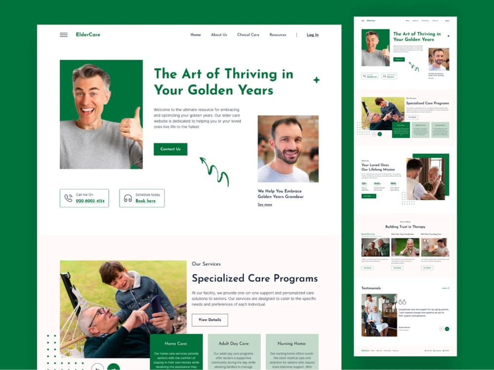
So what does an effective senior living website actually look like?
TL;DR: How to Design a Senior Living Website That Converts Visitors into Tours
- A strong senior living website must load in under 2.5 seconds, be mobile-first, and meet WCAG 2.2 AA accessibility standards.
- Sites that build trust fast, through real photos, calm design, and simple navigation, convert more families into booked tours.
- Above-the-fold content should include a clear headline, real emotional imagery, and one focused CTA like “Schedule a Tour.”
- 8 top-performing senior living websites (like Aegis, Brightview, and Brookdale) show best practices in layout, tour funnels, and local SEO.
- Content must guide users like a conversation: What care do you offer? What does it look like? What do others say? What’s the next step?
- Accessibility improves UX for all users and protects your business legally under ADA compliance.
- Most redesigns take 6 to 10 weeks and fail when they skip strategy, content, or mobile optimization.
- A successful senior living web design isn’t about beauty; it’s about speed, trust, clarity, and conversion.
What Makes a Great Senior Living Website (Speed, Trust, and Clarity)?
Most families don’t give your site a second chance. If it’s slow or confusing, they bounce. If it feels cold or generic, they don’t call.

That’s why great senior living websites focus on three things:
1. Speed that keeps people on the page
Your site should load in under 2.5 seconds. Google calls this “Core Web Vitals,” and it’s not optional if you want to rank or convert. Deloitte found that just a 0.1-second improvement can lift conversions by up to 10% across industries.
Families aren’t waiting for your hero video to load. They’ll click out and pick a faster site.
2. Accessibility that works for everyone
Your visitors aren’t just tech-savvy adult children. Some are older adults with vision issues or motor challenges. That means you need clear contrast, big buttons, readable fonts, and forms that work with screen readers.

The Department of Justice expects WCAG 2.2 AA standards on business websites. Accessibility isn’t extra credit. It’s expected.
3. Calm, clear design that builds trust
Forget flashy animations. A great senior living site feels calm and easy to navigate. Every section should help the visitor feel more confident, not more overwhelmed.
Keep the language simple. Guide them to the next step. Show them who you are, what you offer, and how to schedule a tour.
That’s the baseline. Fast. Accessible. Clear. Anything less, and you’re losing families before you even meet them.
These sites aren’t theories; they’re live examples that prove what good looks like.
8 Senior Living Website Design Examples That Actually Work
You don’t need to guess what works. You just need to look at the communities already doing it right. These sites aren’t just pretty. They guide, convert, and build trust fast.
Let’s start with the first example…
Example #1: Aegis Living: Fewer Clicks, More Tours
Aegis doesn’t waste time. The moment you land, it asks the only question that matters: Where are you looking for care?

No dropdown menus. No scrolling. Just a clean “Find a Community” tool above the fold.
That alone changes everything. Families don’t have time to explore. They want to know if you’re nearby and available. Aegis gives them that in one click.
What else works:
- Sticky “Schedule a Tour” button. It’s always there. No matter where you scroll. No searching. No second-guessing.
- Straightforward service pages. They lead with what they offer: Assisted Living, Memory Care, and Respite, not hidden in menus. Not buried in fluff.
- Design that feels calm. Big text. Soft colors. White space. It looks like a place you’d trust with your parents. That’s not decoration, that’s sales.
This site doesn’t try to impress. It tries to help. That’s why it converts.
What you can steal:
- Put your “Find a Community” front and center.
- Keep the CTA button visible.
- Ditch clever copy. Say what you do.
Simple sells when families are overwhelmed.
Example #2: Brightview Senior Living: Show the Experience, Not Just the Building
Most websites talk about tours. Brightview lets you take one right away.

The homepage gives you a virtual tour without filling out a form. You click, and you’re inside the building. That single move lowers friction and builds trust.
Families don’t just want information. They want to feel what life looks like inside. Brightview gets that.
What else works:
- Strong visual focus. The site leads with real spaces. Dining rooms. Apartments. Smiling residents. Not stock photos. Not fake lifestyle shots.
- Easy care breakdown. Assisted Living, Memory Care, and Independent Living are all clear. Each one has its own page, and each page shows what makes it different.
- Local-first structure. Every region has its own dedicated page. That makes SEO easier and gives families a focused place to land.
It reduces the leap of imagination. Families don’t have to guess what it’s like. They can see it.
What you can steal:
- Add a real tour, not just a form.
- Show actual rooms, not just the exterior.
- Break out each care type into its own space.
The more real it feels, the more trust you earn.
Example #3: The Arbor Company: Trust Comes From the First Scroll
The Arbor Company doesn’t lead with marketing fluff. It leads with people.
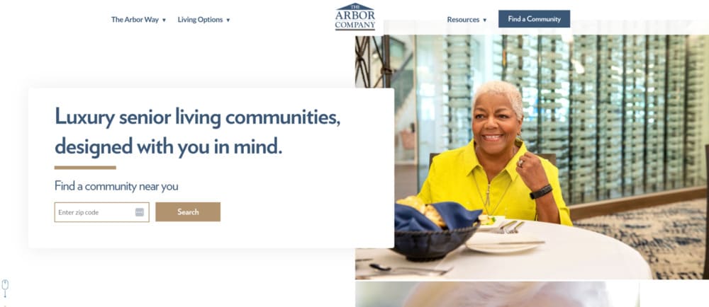
The homepage opens with real residents, real staff, and real moments. No slick promo videos. No polished slogans. Just photos that feel human.
That shift matters. Families don’t want to hear how great you are. They want to see that you care.
What else works:
- Tour requests everywhere. No matter where you are on the site, there’s a clear path to book a tour. Top nav. Sidebars. Bottom of the page. One goal, everywhere.
- Benefit-first messaging. Each care type starts by saying what families gain, not what services you offer. Less “24-hour care.” More “peace of mind when you can’t be there.”
- Simple paths. The homepage guides you to explore communities, learn about care types, or just talk to someone. No clutter. No maze of links.
The site removes pressure. It doesn’t sell hard. It shows care and invites the next step. That builds trust fast.
What you can steal:
- Use real photos from inside your community.
- Talk about what families get, not just what you provide.
- Make booking a tour possible from any page.
People aren’t comparing websites. They’re comparing who feels right.
Example #4: Erickson Senior Living: One Structure, Dozens of Communities
Erickson runs a massive network of senior living communities. But every site visit feels local.
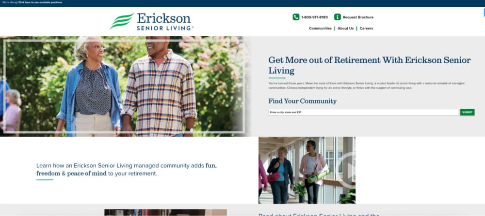
Each community has its own page, with the same structure and the same goal: to help families decide faster.
What works:
- Consistent layout across locations. Every page follows the same format. That builds trust. It also makes the site easier to scale and update.
- Tour CTA is always visible. “Schedule a Visit” isn’t hidden. It’s at the top, the middle, and the bottom. Families don’t need to search. They just click.
- Service and lifestyle details side by side. They cover care types, but also show dining, wellness, and campus life. It’s not just care. It’s a community.
Consistency makes big feel small. Families land on a page and feel like it was built just for them.
What you can steal:
- Use a one-page structure across locations.
- Repeat your CTA. Never assume people will scroll back up.
- Balance care info with lifestyle content.
If you run more than one location, start here.
Example #5: Sunrise Senior Living: Clear Paths for Stressed Families
Sunrise doesn’t try to be clever. It just helps people find what they need.

Right at the top, you get three options: Find a community. Schedule a tour. Explore care types. That’s it. No guessing. No friction.
What else works:
- Navigation made for real people. The menu isn’t full of brand-speak. It’s written for families under pressure. Every link answers a real question.
- Helpful extras above the fold. Financing info, testimonials, and FAQs are easy to find. That keeps visitors from bouncing when they hit uncertainty.
- Mobile-first layout. The design adapts fast. Buttons are big. Text is readable. Pages load quickly even on slow connections.
The site isn’t trying to impress. It’s trying to reduce stress. That’s why families stay.
What you can steal:
- Put the three most important actions up top.
- Don’t hide pricing info or support pages.
- Write your nav like a human, not a brand.
Most visitors are overwhelmed. Your job is to make things easier.
Example #6: Watermark: Each Community Feels Like Its Own Brand
Watermark doesn’t treat locations like footnotes. Every community gets its own space, its own photos, its own voice.
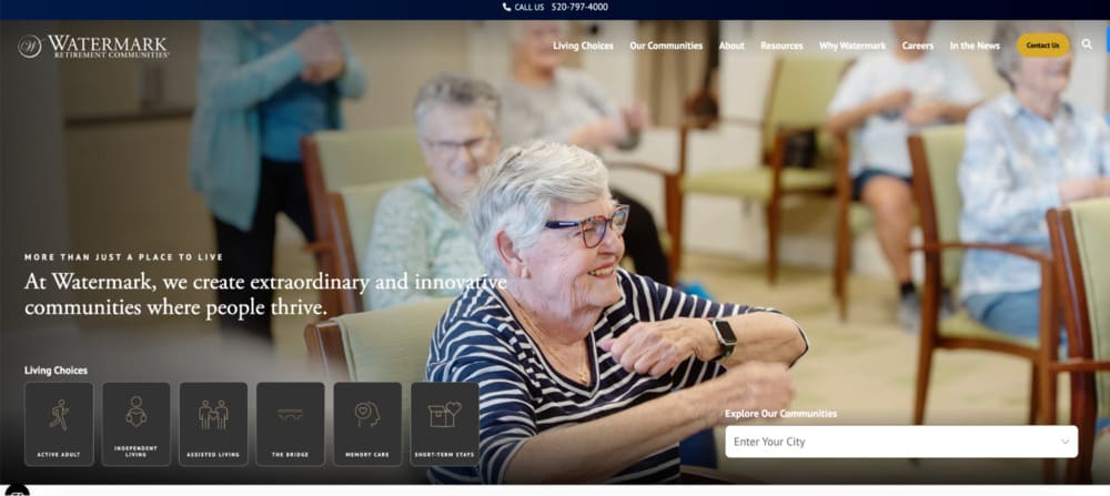
It feels personal. Like a place, not a page.
What works:
- Dedicated pages for each community. They go deep. Photos, amenities, services, activities, dining. It’s not a list. It’s a look inside.
- Simple, clear layout. Each section has one job. No walls of text. No clutter. Just enough to make you want to see more.
- Strong CTA placement. “Schedule a Visit” and “Contact Us” buttons show up often and early. They don’t wait until the end.
Families don’t just want facts. They want a feel. Watermark gives them that.
What you can steal:
- Make each location page feel like a full experience.
- Keep the layout clean. Let the visuals do the work.
- Place CTAs before the visitor gets tired of reading.
Don’t sell a network. Sell the one place that feels right.
Example #7: Maplewood Senior Living: Lead With Emotion, Not Amenities
Maplewood doesn’t open with services or stats. It opens with feeling.
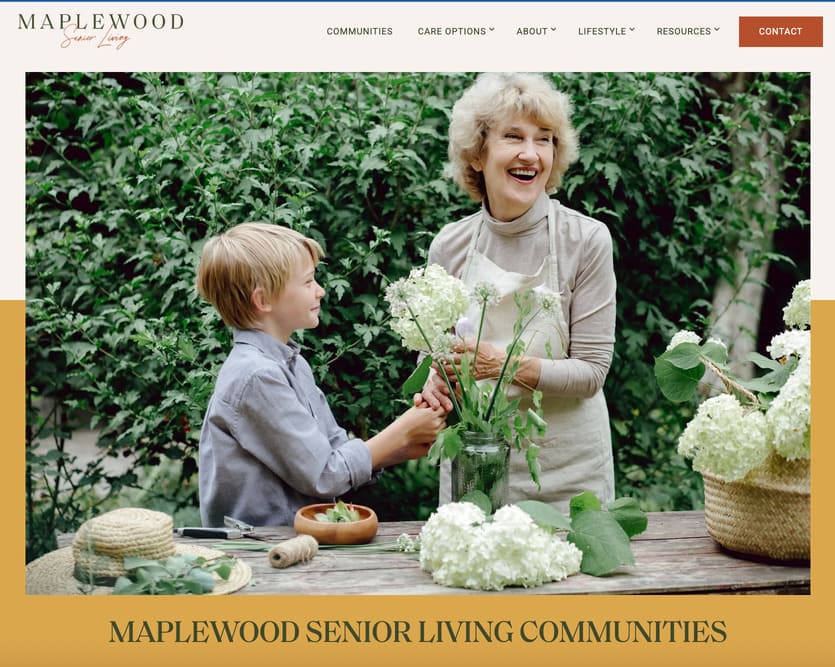
The homepage headline reads: “Live a life of purpose, possibility, and joy.”
That hits different. It’s not about rooms. It’s about meaning. That shift grabs attention and builds trust.
What works:
- Emotional storytelling. From the copy to the visuals, everything centers on quality of life. Not just care, but how it feels to live there.
- Lifestyle over logistics. You don’t get a wall of bullet points. You get guided tours through design, wellness, and human connection.
- Strong, clear CTAs. “Explore a Community” and “Schedule a Tour” are always within reach. There’s no confusion about what to do next.
People don’t just want safety. They want joy. Maplewood sells that. And it feels honest.
What you can steal:
- Start with a feeling, not a feature.
- Show the lifestyle, not just the services.
- Make it easy to explore, then take action.
Care is the offer. Emotion is the hook.
Example #8: Brookdale: Big System, Simple Journey
Brookdale runs hundreds of communities. It could feel overwhelming. But it doesn’t.

The site keeps things simple. It helps people find a location, pick a service, and take action fast.
What works:
- Smart location search. The homepage lets you search by city, zip, or service type. It feels like booking a hotel, not filing a form.
- Sticky CTA buttons. “Schedule a Tour” and “Call Now” are always one tap away. Especially on mobile, that matters.
- Clean SEO structure. Every community has its own page. Every page follows the same format. That helps with rankings and makes navigation feel familiar.
Big companies usually complicate things. Brookdale simplifies. And that’s what families need.
What you can steal:
- Treat your homepage like a search tool.
- Keep key actions visible at all times.
- Use one clear format for all location pages.
Don’t let scale kill clarity. Keep it simple, even if you’re big.
That’s it for now. At Senior Living Occupancy, we use a unique approach that we have developed over years of trial and error, which we call…Now that you’ve seen what works, here’s how we build every site to convert from day one.
Our Senior Living Website Conversion Strategy
Most senior living websites fail because they try to impress instead of guide.

They focus on design trends, not decisions. And they forget that the person visiting is overwhelmed, tired, and trying to solve a real problem fast. That’s why we build every site to do one thing: convert visitors into tour bookings.
Above-the-Fold Is Where You Win or Lose
The top section of your homepage isn’t decoration. It’s your first shot at trust.
Instead of a vague welcome message, we lead with one clear headline that speaks to what families actually care about: safety, warmth, and peace of mind.
We pair that with a single, focused CTA. Not a row of buttons. Not a long menu. Just one next step.
- A clear message: “Memory care that feels like home” or “A safe place for mom to thrive”
- One primary action: “Schedule a Tour” or “Call Now”
- A visual cue: a real photo that builds emotional connection
Google says your main content block should load in under 2.5 seconds. If it doesn’t, you’re already behind.
Pages That Read Like a Conversation
Once you’ve earned their attention, the rest of the page needs to earn their trust.
We follow a structure that mirrors how real people ask questions and make decisions.
- What care do you offer?
- How will this help my loved one?
- What does it actually look like there?
- What have other families experienced?
- How do I take the next step?
This structure reduces bounce rates and keeps visitors moving. The site isn’t just talking at them. It’s walking them through a decision.
Built for Phones First

More than 70% of traffic to senior living sites comes from mobile devices. So we don’t treat mobile as an afterthought. It’s the default.
- Buttons are big enough to tap without zooming
- Phone numbers trigger click-to-call instantly
- Layouts stack naturally so no one has to hunt for key info
Families shouldn’t have to fight your site just to schedule a tour. Especially on a phone.
SEO Is Baked In, Not Tacked On
We don’t launch a site and “do SEO later.” It’s part of the build.
- Pages target terms like “assisted living in [city]” and “memory care near me”
- Every location gets its own optimized, structured page
- We apply metadata, internal linking, and schema from day one
- Core Web Vitals like speed and stability are built into the design
This is the same structure used by large operators like Brookdale and Erickson, who manage hundreds of locations without sacrificing performance or rankings.
Most families won’t give you a second visit. You get one shot to show them you care, that you’re credible, and that it’s easy to take action.
We build pages that load fast, speak clearly, and guide action. No clutter. No confusion. Just results.
And while design and structure matter, accessibility is just as critical for both people and compliance.
Senior Living Website Accessibility: Simple, Legal, and Effective
Accessibility isn’t just a legal checkbox. It’s how you make sure every family member can access your care, no matter their ability, device, or age.
And yes, the legal pressure is real. In April 2024, the U.S. Department of Justice confirmed that businesses open to the public, including senior living communities, must make their websites accessible under the ADA.
But here’s what most operators miss: accessibility helps your bottom line.
Most Fixes Are Simple and Valuable
You don’t need to overhaul everything. You just need to follow the WCAG 2.2 AA guidelines; the same ones we build into every site we design.
Here’s what that looks like in practice:
- Readable contrast. No gray-on-white text.
- Keyboard navigation. Every action works without a mouse.
- Alt text on images. Not just for SEO ; for screen readers.
- Accessible forms. Labeled fields, error feedback, clear structure.
- Video captions. Especially on tour previews or resident stories.
- Accessible PDFs. Downloads should work with assistive tools.
If you’re unsure where you stand, we recommend starting with an ADA compliance audit ; it’s part of every redesign we do.
Good Accessibility = Better UX
Accessibility helps everyone. It’s not just for screen readers.
- Clear layouts help stressed families focus
- High contrast improves reading in bright rooms or aging eyes
- Bigger buttons boost conversions on mobile
It’s like curb cuts on sidewalks ; designed for wheelchairs, but a win for strollers, carts, and luggage too.
And when over 70% of your traffic is mobile, that extra clarity means better engagement across the board.
Built In, Not Bolted On
We don’t treat accessibility as a “plugin” or something to fix later. We design for it from day one. Every site we build is designed to meet WCAG 2.2 AA ; tested, documented, and ready.
Because if your website isn’t accessible, it’s not working for the people who need it most.
If you want to learn how accessibility fits into a full growth strategy, check out our full senior living marketing guide.
If you’re planning a redesign, here’s what to expect in terms of timeline, scope, and cost.
How Long Does a Senior Living Website Redesign Take (and What It Costs)?
A redesign should make your website better. Not slower. Not more complicated. Not more expensive than it needs to be.
Here’s how we keep it simple and get it done.
Most Sites Take 6 to 10 Weeks
That includes everything:
- Strategy
- Wireframes
- Copy
- Design
- Build
- Launch
You don’t need six months. You need a clear scope and fast decisions. We guide you through it all.
What Makes Projects Slower or More Expensive
If you want to move fast, avoid these:
- Multiple locations without a plan for structure
- Waiting on photos, approvals, or content
- Custom features you don’t actually need
We handle CRMs, live chat, forms, video, and more. But the more moving parts, the longer the build.
Need something lean? We’ve launched clean, conversion-focused sites in under 30 days.
The Real Risk Is Launching the Wrong Site
Pretty isn’t enough.
If your new site is slow, hard to update, or doesn’t convert, you wasted time and money. That’s the risk. And most agencies don’t talk about it.
Here’s how we prevent it:
- Clear copy that drives action
- Fast-loading pages that pass Core Web Vitals
- Strong SEO structure
- Launch plan with redirects, testing, and analytics
- Built on WordPress or Webflow so your team can edit without code
You don’t need the fanciest design. You need the right one ; one that books tours. Here’s exactly how we execute, from strategy to launch.
How We Build Senior Living Websites Step by Step: Our Entire Approach Explained
Most redesigns fail because they skip the thinking. They jump into design without a clear plan. We don’t. Here’s how we build senior living websites that actually get results.
Step 1: Discovery and Strategy
Before we touch a line of code, we get clear on three things:
- Who you’re trying to reach: Are you targeting adult children? Seniors doing their own research? Local referral partners? Each one has different questions and needs.
- What you want the site to do: More form fills? More phone calls? Faster tour bookings? We define success up front so every page works toward it.
- What’s broken today: Maybe your site loads slowly. Maybe it’s buried on Google. Maybe it’s just outdated and doesn’t reflect who you are. We dig into the problems so we don’t repeat them.
This stage takes a few days, not weeks. We ask smart questions. We listen. Then we map the right approach.
This strategy becomes the blueprint for everything that follows.
Step 2: Wireframes and UX
This is where we sketch the structure.
No logos. No colors. Just layout.
Wireframes show how content flows, where CTAs live, and how users move from page to page. It’s not about looking good. It’s about making the site work.
We focus on:
- What shows above the fold
- How care types are introduced
- Where to place trust signals
- When and where the tour CTA appears
This is where bounce rate is won or lost. A bad layout confuses people. A good one makes the next step obvious.
You review it. We revise it once. Then we move forward.
No wasted time. No design guessing.
Step 3: Copy and Content
This is where most sites fall apart. They look great but say nothing.
We write every word with one goal: to move the visitor to action.
Each page has one job. It might be to build trust. It might be to answer a fear. It might be to get a tour booked. We write for that, not for word count.
Here’s how we do it:
- Headlines that speak to what families care about
- Short, clear copy that sounds human
- Emotional proof, not empty claims
- Buttons that guide action, not distract from it
- FAQs that kill doubt before it grows
We also write with SEO in mind. Your location pages will rank for terms like “assisted living in [city]” and “memory care near me” ; not someday, but from day one.
Every word earns its place. No fluff. No filler.
Step 4: Design and Development
Now we bring it to life.
Design isn’t just about colors and fonts. It’s about tone. Feel. Trust. A calm layout with real photography can do more for conversion than any animation ever could.
We focus on:
- Clean, modern design that reflects your brand
- Mobile-first layouts built for speed and clarity
- Real photos whenever possible ; no stock smiles
- Clear contrast, big buttons, strong typography
- WCAG 2.2 AA accessibility built into every element
Once the design is approved, we build. Fast, clean, and tested on the platforms that work best for your team, usually WordPress or Webflow.
No bloated themes. No locked-down templates. Just clean code built to load fast, pass Core Web Vitals, and support long-term SEO.
Step 5: QA, Launch, and Optimization
This is where most agencies disappear. We don’t.
Before launch, we run a full QA sweep:
- We test the site on desktop, mobile, and tablet
- We check loading speed, mobile responsiveness, and accessibility
- We verify internal links, forms, and CTAs work exactly as expected
Then we launch, without the usual chaos.
We handle:
- Redirects from your old pages so SEO rankings don’t drop
- Analytics setup so you can track calls, forms, and clicks
- Core Web Vitals testing to make sure you meet Google’s standards
Post-launch, we stick around. If your team wants to self-manage, we train them. If you want ongoing support, we handle updates.
Your site goes live, fully optimized, and ready to convert. No guessing. No delays. No mess. By the time we hit publish, your site is already working for you; now let’s bring it home.
Final Words: Why a Senior Living Website Should Fill Rooms, Not Just Look Good
Families don’t need another brochure. They need a reason to trust you.
That starts with a website that loads fast, answers their questions, and makes the next step obvious. A site that’s built for the way people actually search, scroll, and decide.
That’s what we build.
Not for clicks. For move-ins.
If you’re ready to launch a site that brings in leads and fills rooms, let’s talk.
